Wednesday, April 29, 2015

Abandoning Tradition & Encompassing Style by Christine Hinojosa


       In 1947, only three homes were used to fulfill classroom and facility needs at The University of St. Thomas (STU).  Through time, attendance grew and space dwindled.  Wanting to expand, but lacking the funding, the university needed a generous donor.  Dominique and John de Menil answered the call. The Menil’s were very progressive and wanted to express a contemporary movement that was changing architecture.  In 1956, Philip Johnson was hired by the Menil’s to create an enticing campus master plan which would accommodate the neighborhood and bring the community together (Sullivan, 2005).  Mr. Johnson was the obvious choice to fulfill and achieve the daunting task that was envisioned.  He paved the way to St. Thomas University’s building expansion and the direction it was heading.  Mr. Johnson was steadfast in the evolution of architecture and broke into the Modernist movement, a transition not many were accustomed to.  With much inspiration, Mr. Johnson created a system of sleek lines, exposed steel, industrialized colonnades all designed together to add intensity to the universities structure.  His programmatic design presence is felt as one walks through the campus.  It is a minimalism that makes a vast impression aesthetically and serves a substantial purpose to the faculty, students and surrounding residents.

        Phillip Johnson’s inspiration for STU was that of Thomas Jefferson’s University of Virginia Academic Village.  The standard model of architecture at that time was to stay true to the classical style which consisted of ornate columns and temples. These correlations to classical architecture are what the modernist movement wanted to detract from and prove that simple, minimal, clean horizontal and vertical principals were the elements that would make effective, evolutionary design.  The similarities Mr. Johnson wanted to include in his program for STU include the uniting of public spaces, halls, library and chapel, public open space of the lawn, and a continuous colonnade uniting buildings and defining separations within the pavilions (Sullivan, 2005). The materials and facades are minimalistic in a modernist fashion.   Mr. Johnson used the open lawn design to separate and concurrently unite the flat roofed rectangular shaped buildings.  The use of repetitive rectangular shapes and long rows add a great space for people’s interaction around the campus.  This effect proposed to build relationships within the campus and enhance the learning experience for its students.  

      The quote “Less is more” is associated with Peter Behrens, and more famously with Ludwig Mies Van der Rohe.  According to William J.R. Curtis’ book Modern Architecture Since 1900 (1992), “It was the reduction of form to the most expressive simple geometries, and the radical redefinition of basic classical types” that set Mr. Van der Rohe’s work apart.  Mies Van der Rohe is a mentor, friend, and great inspiration to Philip Johnson.  Mr. Van der Rohe designed Crown Hall at the Illinois Institute of Technology, which Mr. Johnson found great elements of aesthetic ideals, design philosophy, enclosure systems and a conduit to express to the blossoming architectural world that there was no typical order for a university and its design could transform into the dynamic aesthetics of modernism (Sullivan, 2005).  Following in Mies’ footsteps, Mr. Johnson chose an industrial style of exposed steel, columns, beams, and glass for his design at STU.  Mr. Johnson designed the quad’s first three buildings: Welder, Jones, and Strake Hall in 1956-1958 (Gray, 2007).  He chose an axial plan, with junctures of horizontal elements that would accommodate any future expansion.  

        Forty years later the addition of the Chapel of St. Basil would be the hierarchy of Mr. Johnson’s design and ultimately the pivotal point to the union of his program at STU (Gray, 2007).  The campus now spans 3 city blocks and stretches its aesthetics into the surrounding neighborhood of Montrose.  Many years had passed since Mr. Johnson initially started the universities’ layout and his current mode of design was very different.  He built the chapel in a contrasting way compared to the original buildings.  Materials used include white stucco, concrete, granite, and a golden dome. This new approach helped to express the changes time had made on his way of design and the city of Houston (stthom.edu).  

       Architects and designers were still clasping on to an old essence of form and order.  This modernist style was gradually becoming the norm but was not common for Houston, let alone the community of Montrose.  “Less is more," this is the language that Mr. Johnson’s design wanted to convey.   The common characteristics we see in the succeeding buildings, not built by Mr. Johnson, demonstrate the rhythm he strived to create.  Even though architecture falls in to certain categories, there is always individual interpretation that happens between architects.  A great architect encourages growth and displays visual principals with new styles and qualities.  Classic architecture will always have a place in history but designing better buildings means new concepts.  Ornate or simple, conventional or futurist, neoclassical or modern, there is an order to architecture, however, there are no limits

 References
University of St. Thomas, Chapel of St. Basil
Retrieved from http://www.stthom.edu/About/Catholic_Identity/Chapel_of_St_Basil.aqf

Gray, L.  October 3, 2007.  Philip Johnson's final work in Houston is for St. Thomas.  Houston Chronicle.  Retrieved from http://www.chron.com/life/article/Philip-Johnson-s-final-work-in-Houston-is-for-St-1827662.php

Sullivan, M. A.  2005.  Chapel of St. Basil, University of St. Thomas.  Retrieved from http://www.bluffton.edu/~sullivanm/texas/houston/stthomasbasil/basil.html

The Bank of American Center by Gabriela Degetau


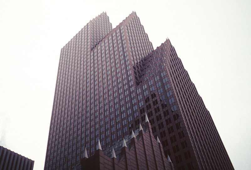
       The Bank of America Center designed by Philip Johnson and his partner Burgee, is a high-rise representing one of the first significant examples of postmodern architecture construction in downtown Houston, Texas. The building characteristics emphasize the postmodern style. Two concepts that can be pointed out to describe the building are: Ornamentalism and revivalism.

        The Postmodernist movement began in America around the 1960s - 1970s and then it spread to Europe and the rest of the world, to remain right through to the present. Postmodernism is a new way of viewing the world; it is unpredictable and more creative. It is committed to pluralism, heterogeneity and global culture; it acknowledges the variety of taste cultures and visual code users.  It tends to be more aesthetically complex, playful and fantastic, exhibiting a new classicism and monumentalism. In response, architects sought to reintroduce ornament, color, decoration and human scale to buildings. Form was no longer to be defined solely by its functional requirements or minimal appearance. Unlike modernism, it utilizes a wide variety of styles, tradition and codes. Revivalism can be defined as a collage of historical styles. It was one of the most popular notions in postmodern architecture. Revivalism or in other works the earlier practice of “ imitating new styles”, lead architects imagination and artistic sense to be fully exercised. Architects turned towards the past, quoting past aspects of various buildings and melding them together. As Jameson describes, “ random cannibalization of all styles of the past, the play of random stylistic allusion” (Jameson, F. (n.d.). Postmodernism, or, The Cultural Logic of Late Capitalism.).

        The Bank of America Center is a 56-Story office tower. The interior and exterior of the building is sheathed in rough textured Napoleon red Granite, quarried in Sweden and finished in Italy. The office tower is divided by two major set backs into three segments, giving the appearance of three adjoining buildings. The sculpted metal obelisks, made from lead and coated copper, rise from every roof level creating a unique silhouette and dramatic coloring. The obelisks are eight feet tall on the gable ends, with the topmost finials a crowning 12 feet high.  The lobby is highlighted by a 18 foot Seth Thomas Clock. The entrance   from Louisiana Street is an impressive seventy-five foot high, arched granite doorway. (n.d.). Retrieved March 28, 2015, from http://bankofamericacenterhouston.com/building.html). Some of the characteristics mention above show, how the Bank of America Center is a clear example of Postmodernism: The colorful and distinctive shapes of the building, the luxuriant stone and the spectacular zigzag silhouette.  Johnson points out, “ I like the Middle Ages- the last time a tower in England was very important was the late gothic. I picked up a few commercial and lowlands things for the NationsBank”. (Dupr, J. (n.d.). Skyscrapers: A History of the World's Most Extraordinary Buildings (p. 13).

       Architectural concepts have been borrowed from 17th Century and it is reminiscent of the Dutch Gothic architecture of canal houses in The Netherlands, this reflects one of the main characteristics of postmodern architecture, revivalism. The decision of applying Dutch renaissance in a modern Context was made in 1979, when Johnson began designing the building. The site was block across the street from the dark prismatic Pennzoil Building, at first Johnson wanted to do something sympathetic to the heralded Pennzoil. The Proposal was to design something complementary in massing and minimalist in detail. Nevertheless, Gerald Hines was not satisfied with the idea. He wanted something unique saying “ The Republic Bank building has to have its own identity, totally different from Pennzoil.”  That is when they decided to do the opposite.  Johnson adds,  “ One of my favorite skyscrapers is my own, The Bank of America center. It isn’t considered a very good skyscraper because its postmodern- decorative and historically reminiscent. But is no about Dutch gables, it’s how I used them- to emphasize the upward thrust and the tripling up. To make it memorable.” (Philip Johnson, “Philip Johnson interview”).

        The term “ornament” derives from the Latin verb ornare, “to adorn”. However, in art the term is often used to describe not only an adornment or embellishment but also a design in its entirety, that is, an artistic composition as a whole. “Ornament” refers to a single stylized image, which can be placed in any desired position”(Everz, B., & Franz, R. (n.d.). Definition and Development of the Term “Ornament”). In comparison to the minimalistic aesthetic of modern architecture, the combination of styles leads to the use of ornaments. They exist for aesthetic or their own purpose. Is the 'essence'' of a building expressed by patterning, colors and other forms of decoration. Postmodernism starts to apply purely decorative element in its facades. This eclecticism is often combined with the non-orthogonal angles and unusual surfaces.  One building form that typifies the explorations of Postmodernism is the traditional gable roof used in the Bank of America Center, the metal obelisk and the arches are other example of applied decoration. Another return was that of the “wit, ornament and reference” seen in older buildings in terra cotta decorative facades and bronze or stainless steel.

       Revivalism and ornamentalism are concepts that help to describe the building; the relationship to previous styles and the decoration of the building are characteristics that make the Bank of America Center a perfect example of postmodern architecture. The late Gothic style and the applied Dutch renaissance, the 100 pieces around the arch brought from Spain and the red granite, are details that create the essence of the building. It represents one of the first significant examples of postmodern architecture reminiscent of the Dutch Gothic architecture. A decorative and eclectic building was the result, and it became iconic in the Houston skyline.

References

http://significanthomes.com/architect/philip-johnson/
http://www.telegraph.co.uk/news/obituaries/1482161/Philip-Johnson.html
http://www.hines.com/property/detail.aspx?id=257
http://www.ministrytopostmoderns.com/explained/architecture/159-defining-postmodern-architecture-and-its-characteristics
http://www.ornamentalprints.eu/en/begriff_abgrenzung.html

The Architecture of Philip Johnson (Payne Lewis)
Philip Johnson & Texas (Frank D. Welch)
Philip Johnson, Life and Work (Franz Shulze)
Philip Johnson in Houston- Image and Imagination (Valentin Gertsman)
Beginning Postmodernism (Tim Woods)
Postmodernism, or, The Cultural Logic of Late Capitalism (Frederic Jameson)
Changing Ideals in Modern Architecture, 1750-1950 (Peter Collins)
The New Paradigm in Architecture: The Language of Post-modernism (Charles Jencks)
Skyscrapers: A History of the World's Most Extraordinary Buildings (Judith Dupr)

Postmodern Architecture: Restoring Context Princeton University Lecture (http://www.princeton.edu/ ~mbhansen/eng377/lecture5.pdf)
Postmodern Architecture and Urbanism University of California - Berkeley Lecture (http://arch.ced.berkeley. edu/courses/arch170/past/SP2001/05-01-01.html)

Tuesday, April 28, 2015

Modernist or Post-Modernist: That is Always the Question! by Jana Andrews

           
       Nestled in Houston, TX among beautiful examples of modern Architecture, like Philip Johnson’s Pennzoil Place and Renzo Piano’s Menil Collection, lies the Houston Galleria at 5085 Westheimer Rd. With its huge, glass barrel vault and three-story atrium, the Houston Galleria has become a gathering place and icon for the Houston area. Many consider Gerald D. Hines’ Galleria to be a modern marvel that has drawn visitors and income to the Post Oak area. While the latter may be true, the Galleria can hardly be considered a modernist building, especially after researching Post-Modernism. Considering the Galleria’s concept is historically and human based, the Galleria is quite the opposite of the modern day clean cut Modernism.

    Modernism and Post-Modernism are often confused in today’s culture. Best described in Modern/Postmodern by Silvio Gaggi, “the term postmodern is unfortunate…if modern is used to describe that which relates to the present or the most recent, how can anything (except the future) be postmodern?” (Gaggi, 1989, 17). Many would assume that postmodern is more futuristic, while in reality it often reflects to history for design ideas and concepts. The Galleria is no different. When Gerald D. Hines began his search for a precedent to the Galleria, he went back to the Galleria Vittorio Emanuele II of 1861 rather than using a modern shopping center/gathering space. In post-modern architecture, this is refered to as Historicism, meaning the architect “chooses a historical model as his point of departure, tries to pay tribute to the modern and so ends up boding in both directions” (Klotz, 1988, 49). Hines wanted to create a space that has the same function and appeal as the Galleria Vittorio Emanuele II, yet make it modern enough that people would be drawn to it and want to visit the building not only for the shopping, but also for the experience and architecture. Hines did not directly copy the Galleria Vittorio Emanuele II, but he borrowed the glass vault atrium space as a way to provide light to the three story atrium space as well as to create a focus toward the centralized gathering space that is the indoor ice- skating rink.  He was able to successfully merge the classical idea of gathering spaces with the modern idea of an indoor ice-skating rink, creating a beautifully historic postmodern concept. If he had done this “naively…in pure imitation rather than as a counterpoise to modern architecture, its value as a new insight” would have been lost, leaving nostalgia and bad architecture as the only remnants (Klotz, 1988, 51). Not only are the architectural aspects historicized, but the function of the building is very much the same. Both were “intended to provide an upscale mix of shopping and dining” experience for the community and visitors (Meeks, 2012). Robert Venturi reflects on this concept, when he states that we can not “criticize these replications of a classical masterpiece in a different place for a different use, although we suggest the replication would have been done better if it had been accepted philosophically and used wittily” (Venturi, 1972, 138). It is not just about the success of the architecture, but also the way they are used. If a representation is too literal (like HOK’s Neiman-Marcus) with no similarity in function, the project can fail. When modernists tried to attempt historicism, mainly failed by trying to make a” Beaux Arts Department Store designed after an Italian Palazzo” (Venturi, 1972, 138). When HOK tried again with Macys and the Galleria, they took the “short walk from Neiman-Marcus to Macy's, from monastery to palazzo, from "duck" to "decorated shed," from modern to postmodern, there are tangible lessons to be learned about the final effectiveness of the stylistic overhaul” (Pope, 1987). The Galleria Vittorio Emanuele II was successful in creating spaces that the community and visitors wanted to visit, and Hines followed suit by not replicating, but rather modernizing those ideals.

      The establishment of a place that would draw not only economy to the newly developing Post Oak area, but also design a place people want to be in. The balance between functionalism and the importance of the human were almost totally voided out by Modernist Architecture. Architecture, such as Philip Johnson’s Glass House, Mies’ Farnsworth House, and Zaha Hadid’s Vitra Fire Station, may have been considered beautiful architecturally, but they failed in their function and they voided out any human interaction. The Farnsworth House could not be lived in by the owner, so it has become a museum for Mies. Postmodernists did not focus directly on creating “buildings as machines for living”, instead they merged that ideal with building “for people, by people” (Scott, 2013). Post Modernists often described Modernist buildings as “soulless and bland, overly simplistic, and abstract” and “felt the buildings failed to meet the human need for comfort, both for body and for the eye, that modernism did not account for the desire for beauty” (Viswanath, 2012). Hine’s main focus for the Houston Galleria was to create gathering space where visitors would want to come, shop, and interact with one another. Hines took the human comfort aspect into account in the Houston Galleria by creating well lit spaces (even on the first of three stories) and easily navigable circulation. By using the glass atrium vault over the ice-skating rink and atrium, the light can filter all the way through and lessen the need for interior light. Natural light is more beneifical in establishing a comfortable area for visitors as well as beneficial to the aesthetic appeal of the building. By illuminating the ice-skating rink, it becomes a focal point and easily found, drawing visitors to it from across the mall. This lessens the typical chaos of the modern shopping experience (littered with signs and dark corridors) and creates a happier mood where people will spend more money. A difficult to establish balance is necessary when trying to design a success building not only in function, but also when the comfort of the visitors is involved. Postmoderism suggests the as long as a building is functional and people are happy within it, it does not have to be the most aesthetically appealing or technologically advanced building. Those characteristics often make people even more uncomfortable. Venturi’s buildings were sometimes described as “ugly and ordinary”, but he “understood ‘ordinary’ in the sense of ‘everyday reality’” (Klotz, 1988, 145).


    The new additions to the Houston Galleria can be defined as modern, especially in their focus on the shopping experience more than the human experience and the minimalist aspect. The original construction, however, is heavily rooted in postmodern ideals and design. It’s success is derived from its ability to invite visitors in and make them feel comfortable as well as its ability to create a modern version of classical ideals. Gerald D. Hines and HOK were able to come together and create a postmodern precedent for nearly all indoor shopping centers to come.


References 
Gaggi, S. (1989). Modern/Postmodern. Philadelphia: Univeristy of Pennsylvania Press.
Klotz, H. (1988). The History of Postmodern Architecture. London: The MIT Press.
Meeks, F. (2012). A look back: Galleria's opening caught world's eye. The Houston Chronicle. Retrieved from: http://www.chron.com/memorial/news/article/A-look-back-Galleria-s-opening-caught-world-s-eye-3838796.php

Pope, A. (1987). From Neiman’s to Macy’s. Cite Survey: Cite Winter 1987. Retrieved from: http://offcite.org/wp-content/uploads/sites/3/2010/03/FromNeimantoMacy_Pope_Cite19.pdf

Scott, S. (2013). Public Interest Design: The Anthropomorphism of Architecture. Talkitect. Retrieved from: http://www.talkitect.com/2013/03/public-interest-design-anthropomorphism.html

Venturi, R., Scott Brown, D., Izenour, S. (1972). Learning from Las Vegas. London: The MIT Press

Viswanath, H.R. (2012). Modernism & Post Modernism in Architecture. Retrieved from: http://www.lexisnexis.com.ezproxy.lib.uh.edu/hottopics/lnacademic/?verb=sr&csi=389962&sr=HEADLINE(Modernism+%26+Post+Modernism+in+Architecture)%2BAND%2BDATE%2BIS%2B2012

The Coffee House by Elizabeth Westmoreland

          Rice University is a physical manifestation of what people dream higher learning institutions will look like.  Its Neo-Byzantine architecture invokes a sense of importance and grandeur.  As the home of one of the top Architecture Colleges in the world, the campus has evolved with the changes of architectural ideas and styles since its establishment in 1912.  Rice’s Board of Trustees has initiated a plan known as “A Vision for the Second Century” to keep the campus relevant and up to date.  Part of this vision, was a social gathering space for students and professors to interact and share ideas informally. 
Architects Thomas Phifer and James Burnett made the social center of Rice a reality when they completed the Brochstein Pavilion in 2004.  The pavilion exemplifies the Modern concept of minimalist aesthetic.  The project also embodies the post-modern idea of Possibilistic design.  Both of these concepts interact with and integrate the existing campus and community. 
 
            Glass and steel are all that defines the Brochstein pavilion from the prim lawns of Rice.  The transparency of the building invites people and the landscape of the university indoors.  The project, “with a deft immaterialism, bridges the physical and metaphoric outside and inside, encouraging movement through and around the library and connecting the new residential colleges rising on the south with the science facilities emerging to the north” (Broome).  The incorporation of the building and landscape is made possible by stripping the building down to only what is necessary.  The building has been called a study in restraint and the purity of form” (The Brochstein Pavilion at Rice University).  The light steel structure allows the building to become a glass box without any obstructions to the view of Rice’s manicured grounds, with their rows of live oaks (Gray).  The stripping of ornamentation comes from the Modernist style of architecture.  Modernists believed that “architectural designs should bear no more ornament than is necessary to function” (Rowe).  The Brochstein Pavilion expresses the Modern ideal that the building, bearing no unnecessary ornament, and the open space surrounding the structure as well as the open plan interior lends itself to the ideals of social living and communication” (Rowe).  The Brochstein Pavilion uses the Modernist ideals of stripping everything unnecessary away to open itself to the landscape, campus, and community of Rice.  The landscaping of the Pavilion is an extension of its architecture that allows it to reach across campus and pull people in.  Anyone who visits the coffee house can see that “the trees and landscape are just as much a part of the architecture as the building” (Broome).  The simplicity of the building allows it to float lightly amongst the heavy masonry buildings of the rest of the campus.  The project does not try to compete with the decorated stone facades surrounding it.  Instead, it communicates with these buildings and ties them together.  The out reaching trellis and landscape “makes the land between the pavilion and the library feel particularly special” (Gray).  The Pavilion is described as a
Rice alumni Jennifer Evans describes the Pavilion as:
A simple glass, aluminum and steel jewel that solves complex issues on campus and activates the open space of [Rice’s] important circulation area.  Its transparency, lightness and immaculate design make this structure a refreshing destination on campus.   
While the heavy masonry used throughout the campus can create a sense of intimidation, the lightness of the Pavilion creates “a welcoming…gesture of generosity that helps you become a part of something” (Broome).  Without its Minimalist Aesthetic, the Brochstein Pavilion would not be able to draw the campus community in and create the social hub that it hosts today.
 
 
The program of the Brochstein Pavilion is simply a glass box with a central mass for restrooms and small coffee kiosk.  The un-programmed space exemplifies the Post-modern idea of Possibilistic design.  Post-modernist buildings did not seek to control the user of the building the way Modern buildings did.  Post-modernists believed that the Modern idea of total control of architecture and how people interacted with it, “leads to social practices and institutions that legitimate domination and control by a powerful few over the many” (Suggs).  Post-modernists wanted to their buildings to be used in whatever way the user wanted, rather than dictating the use of the building.  One of the goals of Post-Modernism was the indeterminacy of space (Irvine).  The use of glass and light structure in the Pavilion blurs the line between the interior and exterior of the building.  The undetermined perimeters of the building combined with the empty floor plan make the Pavilion adaptable by the user.  The Brochstein Pavilion allows itself to be transformed through its “flexible, non-programmed space” (Gray).  The pavilion has no fixed seating in its interior or exterior, allowing students and faculty to arrange the space to their liking.  The Pavilion can accommodate “small impromptu gatherings as well as large public functions” (Gray).  The glass curtain walls of the building and large doors allow the activities within the pavilion to spill out into the landscape when additional space is needed.  Because of the ability to change to its user’s needs, the project has “cultivate[d] greater dynamism and vibrancy on the campus and foster[d] [a] sense of community” (Broome).  The sense of non-programed space continues into the landscape around the building.  The spaces under the trellis of the Pavilion are rarely used in the same way from day to day.  The porches are used for casual chess play, study groups of all sizes, and overflow for events taking place within the Pavilion.  As students and faculty walk by the coffee house, “the trellis renders the porches active participants in the campus circulation” (Broome).  This allows the Pavilion to draw people into whatever is taking place that day.  The project is a “deceivingly simple glass, aluminum and steel jewel that solves complex issues…and activates the open space of this important circulation area” (Evans).  The large open pathways and lawns around the Pavilion allow the exterior spaces of the project to be as flexible as its interior.    
Lisa Gray (2008) observed the following:
A series of wide double doors at the pavilion connect the interior seating areas with the surrounding terrace, opening the pavilion to the landscape and welcoming students and faculty.  The openness of the curtain wall system establishes a strong connection to the landscape, encouraging activities within the Pavilion to flow out into the surrounding Quadrangle.
The Possibilistic design of the Pavilion creates the opportunity for interaction determined by its users.
The mission of the Brochstein Pavilion was to create a space that would facilitate the interaction of people and the sharing of ideas in a casual setting.  The project incorporated modern and post-modern theories to create a space that would communicate with the existing campus, draw people in, and allow them to make it their own.  The project has done this so successfully, that it draws people from across the city of Houston to swap thoughts over coffee and under the shade of the Pavilion.   


References
Brochstein Pavilion / Thomas Phifer & Partners, The Office of James Burnett. (2009, March 17). Archdaily. Retrieved from http://www.archdaily.com/15786/brochstein-pavilion-the-office-of-james-burnett/
 
Broome, Beth. (March 2009). Raymond and Susan Brochstein Pavilion. Architectural Record. Retrieved from http://archrecord.construction.com/projects/portfolio/archives/9030-brochstein-1.asp
 
Evans, Jennifer. (January 2010) Brochstein Pavilion Earns National Award for Excellence in Architecture. Rice News and Media. Retrieved from http://news.rice.edu/2010/01/22/brochstein-pavilion-earns-national-award-for-excellence-in-architecture/
 
Gray, L. (2008, July 2). Brochstein Pavilion: Rice University's Glass of '08. The Houston Chronical. Retrieved from http://www.chron.com/entertainment/article/Brochstein-Pavilion-Rice-University-s-Glass-of-1781716.php
 
Irvine, Martin. (2004). Postmodernity vs. the Postmodern vs. Postmodernism. George Town University. Retrieved from http://faculty.georgetown.edu/irvinem/theory/pomo.html
 
Rowe, A. Hayley. (2011). The Rise and Fall of Modernist Architecture. Student Pulse. Retrieved from http://www.studentpulse.com/articles/515/the-rise-and-fall-of-modernist-architecture
 
Suggs, Marianne Stevens. (June 1997.) Art Education: Content and Practice in a Postmodern Era. National Art Education Association. 
 
The Brochstein Pavilion at Rice University. (2010, January 1). 2010 ASLA Professional Awards. Retrieved from http://www.asla.org/2010awards/352.html

A New Classic by Liliana Hernandez


The Federal Reserve Bank of Dallas Houston branch has become a landmark in the Houston Allen Parkway sector, dividing the park from the beginning of the downtown area. Even though the bank was constructed in 2003, the design of the building is based on Graves early work during the postmodern period of his architecture career. The bank is a clear example of a postmodern building: applying symbolic elements, local materials and ornamentation to not only make a safe building but also establish the architect's belief in what a bank should be. It is important to understand that “Post-Modernism is evolutionary not revolutionary and thus contains Modernist qualities,” explains Frederic Jameson in his book Postmodernism, or, The Cultural Logic of Late Capitalism (Post-Contemporary Interventions), and that those qualities: symbolism, materials and ornamentation, are what make Graves’ Federal Reserve Bank a different approach to bank design.
Michael Graves is known for his large-scale buildings, which apply color and masonry to catch the eye of the observer. What Graves has done is  take large scale buildings designed out of a “tried pattern of late Modernism and recharge it with color, figure, pattern and a sense of formal play that has made his buildings more recognizable from a distance and more accessible to the individual,” explains in his book Michael Graves: Selected & Current Works (Master Architect Series III). However there is more going on than just color in his design, there is also symbolism. Graves interest in history comes from his extensive traveling thru Europe and part of the Middle East. “Classical buildings caused Graves to reexamine his early devotion to modernism,” explains Biran M. Ambroziak in the book Michael Graves: Images of a Ground Tour. For this reason Graves was not in favor of purely glass buildings that are not cost effective, but rather opted to utilize classical elements in his design (a bold statement at the time) marking the era of the postmodern movement in architecture. 
For the Federal Reserve Bank, Michael Graves focused on the historical banks of the south, an element that has guided his design since the beginning. The architect took some of these classical elements like symmetry, brick used as the principal construction material, and columns used as ornaments rather than as structural elements. To these classical elements Graves added a new layer of design by playing with scale, other colorful materials and new symmetrical shapes to re-establish the form and appearance of the modern bank. The Federal Reserve Bank is  often distinguished by its façade, defining the location of the vault by changing the material and color, and thin columns at the entrance, intended to bring a sense of openness and accessibility to people visiting the bank. The form of the building is composed of vertical rectangular elements in plan and only horizontally interrupted by the addition of the vault.  The building incorporates aesthetic elements to be fully functional, such as the open patios defined by colonnades that are used for the bank employees to eat or relax during their free time as not to feel captive.  Roman and Greek colonnades  were historically used in banks to express power and stability, however, Graves uses them to bring openness to the structure. Users of the building find these gestures functional and pleasing to their routine working on the bank.
Ornamentation is a design component which complements, if not defines, Graves’ distinct buildings. The architect uses color, scale, and ornamentation as tools to shape his different designs. He explained his architecture as “a symbolic gesture, an attempt to re-establish a language of architecture and values that are not a part of modernist homogeneity.” The bank is composed of thousands of red bricks, which make up the façade and sides of the building, not only making it colorful but also addressing the safety standards that the bank requires in case of an explosion, making it blast resistant. Blue tiles were used to not only emphasize the vault space from the outside but also to complement the red brick and add a new layer of complexity to the already enormous structure. The building materials were locally produced and intended to represent the essence of historic banks of the south.
Reactions to the building were mixed among people in Houston. Aesthetically speaking, some people like the building and argue that it is a connection to the past, while some  people argue that the massive structure is nothing more than a massive, colorful postmodern building. However after the events of 9/11, New York City governmental buildings started being designed to prepare for a worst case scenario. For this reason, security played a major role in the design, choosing of materials, and regulations inside the building. The heavy masonry structure not only protects the money and people inside the building but also presents a strong front for the outside, establishing a statement of security and of an enduring construction able to resist not only terrorist attacks but the pass of time. Graves said “don’t make something you are not going to be proud of in your lifetime, let alone 100 years from now. Don’t build for the moment…make a classic.”
The Federal Reserve Bank of Dallas- Houston Branch is a building that cannot go unnoticed by pedestrians, due to its enormous size, or by people driving past, because of its rich color. Michael Graves redefined the concept of traditional banks and applied almost playful solutions for issues such as enclosure, safety and functionality by using local materials, classical ornaments and historical elements of the banks of the south. Although not liked by every Houstonian, the building certainly gives the user something to talk about, whether good or bad, and ultimately meets all the requirements needed for the bank to run successful operations.

References
Ambroziak, B. M. (2005) Michael Graves: Images of a Ground Tour. New York. Princeton Architectural Press.
Graves, M. (2006) Michael Graves: Selected & Current Works (Master Architect Series III) New York. Images Publishing.
Jameson, F. (1991) Postmodernism, or, The Cultural Logic of Late Capitalism (Post- Contemporary Interventions). Durham, North Carolina. 
Duke  University Press.
Jencks, C. (1977) The Language of Post Modern Architecture. New York. Rizzoli Internartional Publications Inc.
Jencks, C. (2011). The Story of Post-Modernism: Five Decades of the Ironic, Iconic and Critical in Architecture. Chichester, United Kingdom.
 John Wiley & Sons Ltd.
Moleskine. (2015) Moleskine Michael Graves Inspiration and Process In Architecture. New York. Moleskine.
Nichols, K. (2004) Michael Graves: Buildings and Projects 1995-2003. New York. Rizzoli International Publications Inc.
Venturi, R. (1966) Complexity and Contradiction in Architecture. New York. The Museum of Modern Art Publication.